Social Good App

Summary: Designing a social good app and website for first-gen Korean immigrants
Date: 2022-09-08
Client: Google Career Course UX Design
Tech Stack: Adobe XD, MS Office
Return Home
App for Social Good
🔗 See the low fidelity prototype (Adobe XD)
🔗 See the high fidelity prototype (Adobe XD)
- Project background -
Role: For this project I served as the full UX designer. This included performing initial research, creating personas and user journeys, sketching wireframes, creating low fidelity wireframes and prototype in Adobe XD, running a usability study and synthesizing results, and creating high fidelity mockups and prototype.
Project Goal: To design an easy-to-use app and responsive website for first-generation Korean immigrants to learn about local political issues.
Target Audience: The initial target audience for this project is first-generation Korean immigrants to the United States (immigrated within the past 1-2 years).
Duration: August 24, 2022 - September 1, 2022
- Initial research and ideas -
The initial research focused on determining what type of user would potentially be interested in this app or website.
- Personas and user journeys -
Two user personas and journeys were created to help with the design. The first persona was a compilation of a potential older user. This persona represents the demographic that would be older, likely less tech-savvy, and likely have a lower level of English proficiency. This persona's motivation for the app is to help other similar immigrants learn about issues and adjust to how political things work in the US. They are likely to use their cell phone for everything and have a strong desire to share links and articles with others.

The second persona was a compilation of a potential younger user. This persona is a young professional who immigrates for work reasons. This persona represents users in their 20-30's, is highly familiar with multiple forms of technology, and has a solid grasp on the English language. This persona's motivation to learn about local politics is work-based. US companies are more likely to be openly political and make political statements and have political discussions, so the persona wishes to be better informed about what is happening. Being an office worker who has lots of tech, this persona can use a desktop, laptop, tablet, or phone to access.

- User journeys -
Both user journeys follow similar paths. They log into the app, find either the specific topic they are interested in or peruse the app for a topic, read about it, and then engage in some discussion about it. This is possible online through the app, through sharing (first persona), or offline (second persona). Based on the user journeys, key features are: easy navigation, multiple navigation paths to articles, easy and multiple ways to share articles, language control, and limited levels.

- Competitive analysis -
Three sites were chosen for the competitive analysis: a local newspaper (Austin American Statesman), a state political website (Texas Tribune), and a politics-focused website (Ballotpedia). These three sites were chosen because they seemed to generally represent a large chunk of the type of politically-focused websites at different levels. National-level websites were ignored because the app is designed to focus on local issues. A search did not find any sites that were focused on local political issues for first-generation immigrants. Sites and organizations that do focus on serving immigrants tend to focus on advocacy and legal issues.

The following insights were created based on the competitive analysis:
None of the three organizations focus on immigrants as their primary audience.
While political issues are present in all three, other issues are also covered.
- Initial features and design ideas -
After analyzing the three sites, clear opportunities were discovered for this app.
Focus purely on local political issues.
Offer insights into how issues affect local communities.
Simple is best. Avoid complicated layouts and high-level writing styles.
- Creating the sitemap -
For this project a sitemap was created. Considering the goals of the project, it seemed best suited to a hierarchal design with the top level being different political categories and then dropping down to subcategories and individual topics (IE Education -> School Funding -> Bond Issuance). The side addition that was implemented was a forum. The forum follows the same hierarchal format with the main forum and then the same political categories and subcategories. Within the subcategory members can create their own threads.

- Initial sketches -
The sketches again mainly focused on the key point of navigation. One of the biggest challenges was trying to organize things in a way that made it easy to navigate. News websites and applications often can feel overwhelming due to the large amount of content needed. So, when doing the various sketches I tried to make sure that they had as little content as possible on the screen as well as to utilize the whitespace effectively to help people not feel overwhelmed.
The first sketch focused on the idea of categories (the ones that were listed out in the sitemap). While categories create another level and prevent users from immediately seeing news, it does help simplify the interface and allow for better organization. The second sketch followed the same idea, but had the categories take up more space on the screen to allow for more text (and bigger font sizes). Again, the idea was to make things easier for the user to see and also it allows for better recognition of the different categories. The third screen was a combination of the first two - one category would take up the full width of the screen, but with a smaller image and the text on the side instead of below. This compacts the screen size (less scrolling) and could make it easier to connect the text to the image.

Sketch four was the same as sketch one, but with a different navigation system. The first sketch used a traditional hamburger, side menu along with tab navigation buttons. The fourth sketch dropped those in favor a side-scrollable top menu. This frees up more space for the content, but would allow for less top-level navigation. Sketch five added back the tab navigation, and also showed a screen that took up all the space with images and no text. This could be a more visually impressive option, but it loses in accessibility (text must be over image and no whitespace). The final sketch was Netflix-inspired and took each category and listed the sub-categories beneath in a side-scrollable manner. This sketch allows for a cleaner way to have faster access to the content, but again sacrifices in terms of ease of use and potentially accessibility due to the smaller size for each image and text.

Ultimately, since easy navigation was considered an early priority all three navigation options will be included. The traditional side navigation (under a hamburger menu) to allow the user to easily access all major sections of the app. The tab navigation at the bottom to allow the user to move backwards and access administrative menus. And the categories menu at the top to allow for immediate access to all the categories regardless of where the user is in the app. For the main content, the large image that spans the full screen with text beneath was selected as it appears to be the option that allows the user the cleanest and easiest read of the screen and content. While not on the main screen, the Netflix-style smaller images and text will be used on the subcategory screen to display the various news articles.
- Low-fidelity wireframes design -
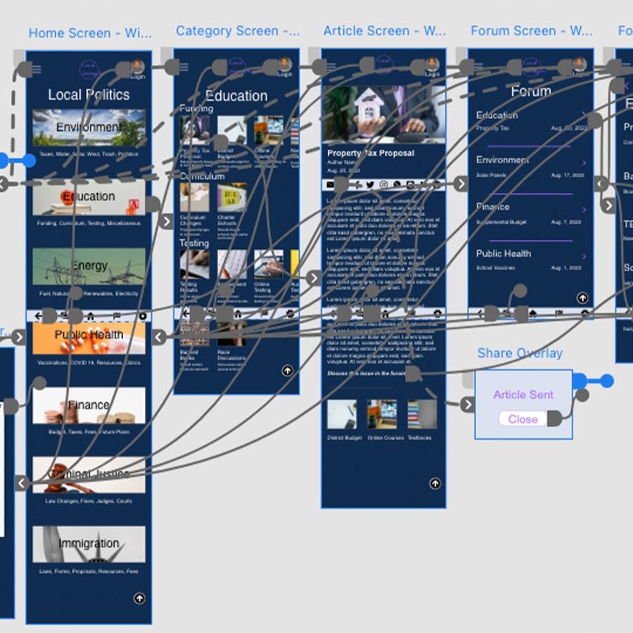
For the initial wireframe, seven screens were created in order to demonstrate the primary user flow for this app. The ability to register and log into the app, navigating to a specific article, and participating in a discussion in the forum. The seven screens created are as follows:
Home screen (with side navigation)
Subcategory screen
Article screen
Main forum screen
Subcategory forum screen
Forum thread screen
Registration and login screen
The home screen wireframe went as planned from the decisions made following the paper sketches. The subcategory screen also followed the design decision made following the paper sketches - to utilize the smaller images and side scrolling to allow users to find recent articles. The article screen was not designed during the paper sketch phase, but it follows a relatively common design flow. A header image is at the top with the main text below and links to similar topics or articles at the bottom. The one decision that I'd like to test in the usability study is the location of the share buttons. In the wireframe they are placed at the top for ease of find, but placing them at the bottom could be better if users want to decide if they want to share the article after they read it.

The forum screens follow a similar flow to the article screens. There is a main forum page where the categories (same as the articles) can be found. Within each category are subcategories (again same as the articles). Within the subcategory are the list of threads (threads are automatically created for each article and users can also create their own). The main forum screen and subcategory screen topics are split by a line to help differentiate them. Within a thread each response is contained within a card that contains the post itself as well as user information.

The registration and login page are relatively straightforward in their design. It is a two-panel card that allows the user to flip back and forth between between registering or logging in depending on their need. All that is required for a user to register is an email address. This could change of course as the project goes on depending on other factors.
- Low fidelity prototype -
The screens from the wireframe were connected together to create the low fidelity prototype. The main user flow tracked a user logging into the site, finding a news article, and then participating in the forum discussion.
You can view and test the low fidelity prototype here.

- Usability study -
A moderated usability study was conducted with five individuals (remotely). The purpose of the study was to assess how easily or difficult it was for participants to register/login to the app, locate articles, and participate in the forum.
The usability study revealed a handful of issues to be corrected in the next design. The main issues centered around participants having difficulty locating features within the app. The two most notable were struggles to locate the page to register or login (a potentially major issue) and to the forum (from the main page). Some participants also expressed a preference to move the buttons to share articles to the bottom of the article rather than the top.
In the end it was decided to address the first two issues in the next round of designs. The decision not to move the share buttons to the bottom were based on two factors. 1) Many people share articles after reading the title or skimming the first paragraph or two. 2) There is a 'Go to Top' button at the bottom of the screen which allows the user to go to the top of the screen (where the share buttons are) in one click.
- High fidelity mockup and prototype -
When creating the design for the high fidelity mockup, the primary focus was on selecting colors that conveyed a sense of trust as well as were easily visible and readable. These articles have the potential to be long, so being easy on the eyes is important (especially on mobile devices).
The first choice was whether to go with a darker background or a traditional white background. White with black text is standard for news, but that also means that it loses a bit in brand identity since all news sites give off similar feels. As such, as darker background was selected to create a stronger brand identity as well as be easier on the eyes if viewed at night or in a darker environment (a light mode is recommended if possible). A dark blue was chosen as the background and a light gray-white for the primary text color to ensure a high level of contrast. A light blue was chosen as an accent color.

Each category screen follows the low fidelity design of having side scrollable articles for each subcategory.

Articles have share links at the top and a link to the forum thread at the bottom as well links to related articles.

The forum follows the same layout and flow as the articles.

The high fidelity prototype did not feature any significant changes from the low fidelity version.
You can view and test the high fidelity prototype here.

- Responsive website (mobile, tablet, desktop) -
A responsive website version of the app was also designed. The mobile version of the site was the starting point and it used the same design as the mobile app version. The tablet version also shared the same layout, but it utilizes the increased screen space to spread the single column into two columns.

The desktop version offered a few new features to take advantage of the screen size - most notably in the forum. In the forum main screen and category screen, when clicking on the preview link, the original post opens on the side so the user can preview what the thread is about.

An additional change on the desktop version is the tab navigation that is present on the mobile and tablet versions transforms into a footer with additional navigational tools.

- Reflections on the project -
Creating designs for both a dedicated app and a responsive website presented interesting challenges and design decisions. The most notable thing that I learned from this project is that it is important to consider the unique features available in an app when designing. Ultimately, I did not take advantage of some of those features (like push notifications) in the design, but it is important to consider the use cases of someone who wants to download a dedicated app vs accessing a mobile website.
If there was time to update and further develop the app/website that is what I would address first. To develop a persona for someone who needs or prefers to use a dedicated app and then revise the app design (as needed) along that use case. One of the challenges with this type of project (a current news type) is that internet connection is important. Without internet it is not possible to update news articles regularly. So, would those users seek a different use case for the app?
Creating a social good app/website was an interesting experience. Personally, I really enjoyed designing this app because I could relate a lot with it. I moved and lived overseas for several years, and I now have family that has immigrated to the US. So, I can relate a lot with that feeling of wanting to know more about local issues, but struggling because of language.
Thank You for Reading!
If you have any questions or comments about this project, the Google Career Course for UX design, or anything else, feel free to email me by clicking the button below!