Site Tree

Summary: A simple 'Linktree' copy site so people can easily access all projects and SNS from one place
Date: 2021-09-09
Client: Self
Tech Stack: HTML, CSS, GSAP
Return Home
Visit the Site - https://tedd-chee-sitetree.netlify.app
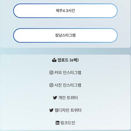
The Project
One issue I've had is that I have several different social media accounts. I have three Instagram accounts, two Twitter accounts, LinkedIn, YouTube (not active currently), and a recently created Gumroad account for e-books. For the Instagram and Twitter accounts, I have different objectives with each account which is why I decided to create separate ones to keep it a little bit cleaner. However, a side effect of that is that since you can only website linked to each account, I've often struggled to decide which site to link each account to. Additionally I have contacts in the US (English speaking) and South Korea (Korean speaking) so I also wanted something that could easily be accessed in either language.
I thought about just using Linktree since it seemed simple enough to set up, but then I thought "I have basic coding skills, why not just create my own simple version?" That way I can have more control over the design, functionality, and features in the 'site tree'. So, that's what this project was. To create a simple site where people can easily access any sites that I have designed and created as well as any social media accounts.
The Design
For the initial design I decided to just stick to something similar to the Linktree style. I wanted something a little nicer then the standard circle profile image, so I decided to go with a banner image. For now I just picked an image that I liked, which is an image of my daughter standing in a field of bright yellow flowers under a clear blue sky. In the future I will probably change this to something more 'business' related. Underneath that are two flags for the language selection. Under that I decided to split the links into two sections: one for websites and one social media.
While it's not the fanciest card/glass style, I decided to go with that for each section. I decided to go with a light blue gradient to match the banner image and also because personally I felt it is easy on the eyes. Again to match the banner and blue-theme the buttons linking to the site have a darker blue gradient which is also present in the links to the social media sites when hovered. However, in the future (maybe in the second round of updates) I'd like the website buttons to maybe contain an image for the site rather than just a gradient, and maybe something similar for the social media sites as well.
The Process
This site is not very complex, so the process of making it was fairly straightforward. I put in all the HTML to get things going. Then I began on the CSS. Since the primary intention of this site is to serve as a starting spot for people coming from social media accounts, I decided it was best to go with a 'mobile-first' approach since most people look at social media on their phone. Simplicity was the key so no super fancy animations or designs. After the initial HTML and CSS were done, I just copied the HTML for the Korean version and translated the buttons and links into Korean. Style-wise everything is the same, so they both utilize the same styling page.
There really isn't any Javascript in this project. I decided to use GSAP just to give it a little 'something' when it loads. Even that was minimal. Right now the two flags animate in towards each other and the buttons for the websites animate up. I decided not to do the social media links at this point because they are below the fold and the animation would not be visible. Also since the scroll amount is so limited adding a scroll trigger seemed excessive. I thought about doing some sort of parallax effect, and maybe one day in the future that will be added.
The Stack
Since there are no special features in this site (just links to different sites and the Korean/English language versions) I just decided to go with a plain vanilla HTML/CSS/Javascript site. So, there's not much to say here about anything. The only 'special' thing was that I decided to use GSAP (Javascript animation library). Even that was not too much at this point.
Reflections
Overall, I feel a little stupid for not doing this site earlier. Already it makes sharing work and linking on social media a lot simpler. Given its purpose I think being fairly simple in terms of design and functionality is good. Could it be better? Probably, and like I said before another round of edits and updates are likely soon. But, I also think there is something to the idea that spending a lot more time on minimal gains is not a great choice.