Responsive K-pop Website Design

Summary: Creating a responsive website design using Adobe XD
Date: 2022-08-08
Client: Google Career Course UX Design
Tech Stack: Adobe XD, MS Office
Return Home
Responsive K-Pop Website Design
🔗 See the case study presentation (Google Slides)
🔗 See the low fidelity prototype (Adobe XD)
🔗 See the high fidelity prototype (Adobe XD)
- Project Background -
Role: For this project I served as the full UX designer. This included performing initial research, creating personas and user journeys, sketching wireframes, creating low fidelity wireframes and prototype in Figma, running a usability study and synthesizing results, and creating high fidelity mockups and prototype.
Project Goal: To create a responsive website for a K-pop site that delivers timely and factual news as well as provides historical context and background to users. The site should also be easily understandable to K-pop newcomers and non-Korean speakers.
Target Audience: The target audience for this website is primarily K-pop newcomers with a secondary audience of individuals who want up-to-date news.
Duration: August 2022
- Initial research and ideas -
Initial research focused on what type of user might be interested in an alternative to existing K-pop websites.
- User personas -
Two personas were created - one a songwriter who is interested in getting involved in writing songs for K-pop companies, and the other a student who uses K-pop to de-stress from studying and work.
The first persona is to represent the primary target user for this website - someone who is new to the world of K-pop and is looking to gain not just news about current happenings, but also context and understanding of the broader K-pop ecosystem. This user could be a new fan who just got interested due to the increasing visibility of K-pop in the western world or it could be someone who is interested in increasing work opportunities as a producer, songwriter, or choreographer.

The second persona is to represent the secondary target user for this website - someone who is familiar with K-pop already and is interested in primarily news.

- User journeys -
Two user flows were identified through the personas. The first one is a user who is more interested in finding out historical and contextual background for current K-pop happenings. This user wants to identify companies, artists, and how things connect together. The second user flow is news-based. This flow focuses more on finding news articles and news connected to specific artists or companies.
- Competitive analysis -
The competitive analysis was done on three other K-pop focused websites. Allkpop, Soompi, and Koreaboo. The three sites - while covering and performing the same basic functions - all are quite different.

The following insights were created based on the competitive analysis:
Competitor sites are focused on news and participation (forums).
Contextual information is often not provided, but when it is, it is complex.
Large amount of news and information often results in complex navigation and 'screen overload'.
- Initial features and design ideas -
Based on the initial research and competitive analysis, a few ideas were developed for the website.
Minimize screen overload by focusing on major stories/news as well as news that is published directly by companies or artists rather than users or third party sources.
Provide basic information on major artists, companies, and historical events/groups.
- Initial sketches -
For the initial homepage design I made six sketches. K-pop is a very visual-focused industry, so most of the sketches tried to focus on being visually appealing to highlight that aspect of the industry. However, in an attempt to include different ideas and perspectives, some designs also tried to focus more on the news aspect and to allow users to quickly and easily get a glimpse of the major stories trending at that time.

In the end, the following choices were made from the sketches.
Have a 'hero image' style at the top for the main story
Have a sticky navigation bar at the bottom of the screen
Have buttons for filtering stories located under the main hero image
Include the site's logo at the top corner due to user familiarity
Have smaller images with a title and brief description text for other articles
- Low fidelity wireframe design -
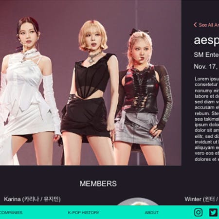
The initial layout for the homepage had the following flow. The main story with a hero image was at the top. Below that the six most recent stories would be displayed with a small image, title, and short excerpt or description. The ability to filter stories based on a few categories (artist name, company name, type of news) is available to the user. Beneath the stories there is a link to access a screen that contains all the stories (this screen was not created, but it would be just a list of the article cards). Below that would be links to four other sections. Two are related to other screens (artists and history) and the other two are outside links to commonly sought after information - song and album rankings as well as music show winners.

The individual company and artist screens also share the same layout. A large image is at the top and next to it is some basic information and a short paragraph about the company or artist. Below that is more detailed information about the artists that belong to the company or the members of the group (if a solo artist then just more information about that one artist). Below that for the company are any artists that disbanded and are no longer a part of the company. For artists a list of any albums they have released as well as any other tracks they may have featured in or collaborated on. Finally, for both all social media links are listed at the bottom.

News articles and history events share the same layout. The main hero image is used at the top of the article along with the title. Buttons connecting to the artist, company, and type of news are available to allow the user to connect to similar news or find out more about the artist or company. The article itself is below that. Finally, at the bottom are a few hashtags for the article and then a handful of similar articles for users to read if desired.

- Low fidelity prototype -
The initial user flows for the low fidelity prototype followed both of the user personas. One tracks through the ability to go to a news article and then to find related articles or information about that artist. The second flow tracks the ability to find information about a group and historical events.

You can view and test the low fidelity prototype here.
- Usability study -
For the usability study, the primarily focus was on a user's ability to complete the website's primary functions: registering an account and logging in as well as locating the various types of news and features (artists, companies, albums, songs, history).
The most common issue was locating the 'featured' history article. The next most common issue was how the site redirects after logging in or registering. The final common issue to emerge was the 'main' story.
Other than these three issues, most of the other tasks went well and the participants had no real trouble completing them.

From these three issues it was necessary to create insights as well as to transform them into corrective actions in the design.
For the redirection to the home page from the log in and register page, it was decided to add a pop-up that informed the user that the action was successful and that the site would now redirect to the home page. This feedback should be sufficient to inform the user and prevent any confusion.
The discussed fix was with the 'featured' history article. In the original design this article is found at the bottom of the home page where there are sections that link out to different external sites as well as other pages in this site. The issue was whether the featured history article should be displayed and linked to on the main history page or not (it currently is not). Adding it would potentially reduce confusion and make it easier to find, however it would also add 'clutter' to the page and it does not exactly fit in with the rest of the site design to have an article link there.
In the end, it was decided to leave the design as is. This is because in the preliminary user research conducted, history was not something that many users seemed particularly interested in. There was some interest in it, hence the decision to include a history page and articles, but given it is a secondary objective, the current design is likely to be sufficient.
- High fidelity mockups and prototyping -
K-pop, particularly these days, has a kind of 'cool' hip-hop influenced vibe to it, so a darker color for the background felt like it better reflected that idea than a white or bright colored background. In order to ensure a high level of contrast with the dark background, white was chosen as the color for most of the text in the site. A bright pink color was chosen to serve as the color for all clickable text (links), and a bright greenish-blue was chosen for the accent color. I checked the contrast levels on the WebAIM site. The pink color for links passed with an 8.63 : 1 score while the greenish-blue color passed with a score of 10.6 : 1.

As mentioned earlier, there weren't too many other changes to the overall design as the usability study did not reveal any major issues with the user flows. The popup described in the usability study section was re-designed to look like as below.

The high fidelity prototype did not feature any significant changes to the user flows from the low fidelity version.

You can view and test the high fidelity prototype here.
- Responsive website creation -
With the desktop version fully complete, it was time to move on to the responsive versions. Both a tablet version (iPad) and mobile version (iPhone 13) were created.
For both responsive versions, there weren't any significant changes done to the site's overall flow and layout. They both saw the space around elements and the number of columns reduced to better fit the screen size.

- Reflections on the project -
This project presented some unique challenges when compared to the previous Google UX course project (bakery app). Notably because the 'end goal' of the user in this project was significantly different from the user in the first project. In the bakery project the user wanted to order some item and then have it delivered or be ready for pick up. This made the user flow and user objectives fairly clearly defined. In this project, the site exists purely to deliver information to the user. Why a user may visit this site, as well as their background knowledge, could vary significantly from case-to-case. As such, this presented a different challenge when considering the project's initial goals. This highlighted the importance of creating effective user personas and journeys to help reduce some of the confusion and highlight a clear(er) path forward.
The other major challenge with this project was the eternal, "design for mobile first or desktop first?" Ultimately, I went with desktop simply because that's the way the project went, but I've become increasingly of the point of view that it is often better to target mobile-first design. This is simply because the number of users that will access the site through mobile devices is rapidly increasing compared to desktop users. Additionally, it feels 'easier' to add to something rather than take away.
On a personal level, I greatly enjoyed this project. This type of site is something I have wanted to create in real life for a while, so time permitting it would be a wonderful experience (and challenge) to see this project through to completion from design to actually being a real website on the internet.
Thank You for Reading!
In the next entry, I'll go over the design for the final project for the Google Career Course certificate (UX design). That project is on designing an app and responsive website for social good.
If you have any questions or comments about this project, the Google Career Course for UX design, or anything else, feel free to email me by clicking the button below!