Me, You, and Jeju Version 2

Summary: An update and upgrade to the Me, You, and Jeju website
Date: 2022-04-20
Client: Me, You, and Jeju Podcast
Tech Stack: HTML, CSS, Javascript (GSAP)
Return Home
Visit the Site - https://www.meyouandjeju.com
The Project
So, I had already done a basic 'Site Tree' type homepage for the Me, You, and Jeju podcast, but they wanted to do a slight upgrade to the site. Specifically, they wanted to add links for each podcast episode so people who listened could find out more about the guest from that episode or whatever topic came out. Simple enough. And for me the actual coding was not too complicated. What was more interesting (and educational) was working with them to find the design, functionality, and features that they wanted.
The Design
So, what made this project a little tricky (and time consuming) was trying to hammer down the details about the design. While they generally knew what they wanted, they did not know how they wanted it to look. And - being a little frank - neither of them are particularly well versed in web technology which meant that what was possible and what was not possible (and the potential side effects) had to be discussed quite a bit. For me this was a very illuminating process as they had a much clearer idea of the homepage when it was made, so a lot of discussion was not needed then. Here the discussion took at least 6 weeks or so as I pitched a handful of ideas to them and they discussed and asked questions. I'll detail more about this process in the next section.
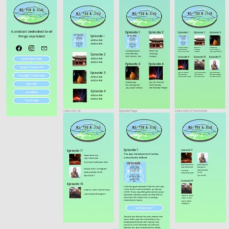
The final design utilized some glass morphism cards that contains links and an image for each episode. If viewing on a computer there are some hover effects on the cards and text to help emphasize the active section. I added GSAP into the project to give it a little animation to spice it up, so the buttons on the homepage and the episode cards on the link page pop into view when the page loads. To lessen the amount of text for the links I used icons to indicate the type of link it was (social media, articles, websites, etc.).
The Process
The process started with some basic ideas that they wanted for the addition to the site. Their ideas were quite general. Basically they just wanted some links and an image for each episode, and they wanted it to be a mobile-first design (the podcast is produced in Korea for people living there, and Korea is very much a mobile device country).
The first thing I did is to mock up three simple variations for them using Figma. One version was a single column with an image and links. The second version was a single column with images that linked to another page that had in-depth information and links about that episode. The third version was similar to the first version, but it had two columns instead of one.
They rejected the single column idea because it might get too long as episodes are continuously added. They also rejected the second version because they preferred the links to be visible on the page rather than having to click to another page. So, the third option - multiple columns that had an image and links for each episode - was selected as the base design idea.
The next step was to nail down the design for each episode. They wanted to have three or four episodes per row, but I informed them that doing so would require either making the text for the links very short or making the text very small. As such I recommended sticking with two episodes per row which they accepted. The next thing I did was submit a few different ideas for how each episode could look and function. One was a simple straight up 'card' with minimal stylings. The second was also a card style, but with a background. The final one was a styled card like the second, but this one had a flip effect so clicking (or touching) the card would flip it around to reveal the links.
The first version was rejected because the text and images for each episode looked a bit jumbled and messy. They both definitely preferred the card background style. They had a little more trouble deciding on whether to include the flip effect. Both (and myself too) liked the effect, but again they wanted a little more simplicity, so the flip effect was out.
The final step before coding it was just some clean up on the overall layout of the cards (what text goes in, circle vs square image styles, etc.).
Coding the actual project was not too difficult. When they approached me to do the site extension it wasn't clear who would maintain the site going forward. Because of that I opted to switch the style language from plain CSS to using Tailwind CSS. In case I didn't maintain the site, I thought that having a more limited/structured styling system would be easier. I also made some slight changes to the sizes and text colors on the main page to make it a little more consistent and easier to read.
The link page was next and came together relatively quickly. I created the glass card effect as its own 'utility class' in the main CSS file that got compiled along with the used Tailwind CSS classes. The final touches were to ensure that the cards expanded and filled nicely when viewed on a variety of different sized viewports, and to add GSAP for some basic animation.
The Stack
As mentioned in the process section, the stack for the site only changed a little bit. It is still a relatively plain vanilla site, so it's mostly just HTML and now Tailwind CSS with some custom CSS added in. The only Javascript at the moment is the GSAP library for animation. The icons all are from Font Awesome.
Reflections
For me personally this project was a hugely beneficial learning process. I'm still relatively new to working and creating sites for other people, so it was quite enlightening to work through a slightly more complicated design process with them. This project certainly reinforced some ideas that I've heard such as communication is key and have a clear idea of design requirements and functionality before getting too far into any coding. As a former teacher I also realized the importance of understanding how different features work as it was necessary to explain why some features are useful and some not so much.
I'm not sure if this will be the last upgrade to this site or not at this point. Personally I think there is much more room to grow (maybe a mailing list or adding some other sections from the podcast), but that is a decision for the podcast owners of course. It also raises an interesting question of what the role and limit of the website designer is. Do I simply respond to what they request and ask when and if they ask? Or do I serve as an advocate for what is possible and what might be beneficial to the site and business? For a freelancer does that decision rest on how much one is getting paid or again on the whims of the hiring party?