Me, You, and Jeju Update

Summary: Landing page and links for podcast
Date: 2022-09-12
Client: Me, You, and Jeju Podcast
Tech Stack: HTML, CSS, Figma, Google Docs
Return Home
Me, You, and Jeju Podcast (update)
Note: This website is not new, but I am doing a re-write on the design process to be more of a full case study.
🔗 Visit the Me, You, and Jeju website here
🔗 See the mockup for the site here
- Project background -
Role: For this project I was the lone UX designer. During this project, I designed mockups, prototypes, and did the web development.
Project Goal: The goal for this project was to design and create a responsive website where visitors can find links to social media accounts and places to listen to the podcast as well as links to guests, articles, and other information.
Target Audience: The target audience is foreigners who live in South Korea and specifically in Jeju Island.
Duration: January - March 2022
- Initial research and ideas -
This project did not have any budget and it was done prior to learning about UX research methods. As such, no user research was conducted nor were any personas or user journeys created. An 'official' competitive analysis was not conducted, but other podcast websites and similar sites were referenced when considering initial designs.
- Project considerations and challenges -
There were a few challenges to consider when designing and creating this site.
The site must be easily scalable - While initially small, the site could get large over time as episodes are added and more and more links are added. The design must be able to easily handle a high number of episodes and links.
The site must be responsive - It was assumed that the majority of visitors would be visiting through mobile devices, but visitors using tablets or desktops should have the same user experience.
Zero budget - This is not exactly a design issue, but it did play into potential design decisions. With no budget, that meant that if using a Content Management System (CMS) such as Wordpress or Squarespace, certain options may not be available as they may need to be purchased.
- (Unofficial) Competitive analysis -
As mentioned earlier, an 'official' competitive analysis was not conducted, but other podcast websites and sites that handle large amounts of 'episodes' were referenced prior to beginning to design the website. Sites like Netflix, Spotify, and the Sporkful were referenced.
- Initial features and design ideas -
Considering the sites referenced as well as the challenges and constraints listed, the following features and design ideas were created.
Use cards to help create space and clear distinction between episodes.
Create several different versions in order to accommodate consideration #3 (budget).
Have different layers (number of pages) depending on the amount of detail wanted per episode.
Keep it simple in order to help ensure that the design can be applied regardless of the system used for coding.
- Creating the data flow/sitemap -
The first thing created was a 'data flow' diagram. It attempted to show three different ways that the site could be created and where data would be stored.

The options list has potential ways the site can be created. This list and the potential pros and cons of each option. This was shared with the podcast owners who opted for option 3. Option 3 is coded from scratch (allowing greater design freedom) and has a landing page that follows the same flow as the popular Linktree option. A separate page is there for episode links.

- Initial mockups -
Initial design versions focused on different ways to display the episodes and links. Initial conversations with the podcast owners focused on how much information and content would be in each episode.

The landing page design was decided relatively quickly. The podcast logo and description would take up the space above the fold. There would be icons for the podcast's social media accounts and buttons that go to the different places visitors can listen to the podcast as well as the links page.

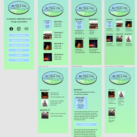
The more major decisions lay in the links page. How much text should be included? How many columns? Should visibility be prioritized and another layer (page) be added? The first version prioritized having plenty of whitespace and space for larger text. An image is used for each episode with links to the episode next to the image. The second version 'cleaned' up the design a bit by adding an individual page for each episode. So, on the episode link page there was just the image and the title of the episode.

The third version and fourth versions followed the same pattern as the second version, but with increasingly smaller images and text to allow for more episodes to appear on a row (2 -> 3 -> 4).
As a side note, the colors were selected by the podcast owners. They are the 'official' colors for the podcast. From a design perspective they are a little bit troublesome as they fall into that range of shades that aren't entirely ideal for white or black text.
- First round of decisions -
These designs were shared with the podcast owners who had a strong preference for the first version. They did not like the idea of having another full page for each episode. They were also concerned that the text might be too small for viewers with three or four episodes on each row. This led to the next round of designs which focused on how best to display the links on one page.
- Second round of designs and decisions -

The first version again focused on promoting the highest level of visibility and readability by keeping the 'card' to only one per row. It is the same as the initial design for the link page in the first round. The second version put two cards on each row with the links below. The third version showed different potential versions of the same design idea (image with text next to) with different numbers of cards on each row.
Again, these were shared with the podcast owners, who took preference to the third option with two cards on each row.
- Coding the initial design -

Since the site only has two pages (everything else links to outside URLs) a prototype was not constructed.
The initial coding of the website was done as designed. On the landing page, hover effects were added to the buttons and social media icons. The icons turn white when hovered and the buttons turn to a green color.
- Updates -
After a few weeks, updates were made to the site's design. This was not due to any complaints or issues with the initial design, but were pre-planned updates (the initial plan was to get the site up as soon as possible to 'catch up' with the podcast itself, and then implement updates).
The changes themselves were relatively minor.

Change button border and text on the landing page to black (from white).
Add a background to the episode cards to help create clearer distinction between episodes.
Add simple animation to pages.

- Reflections on the project -
The biggest challenge with this project was balance. Balancing design ideas with coding challenges with client wishes. Creating a design that is attractive and fitting of the product while also maintaining good design principles. Doing that while also creating a design that is not overly complicated in terms of coding.
An additional challenge was communication. The clients were not difficult to communicate with by any stretch, but there was difficulty because first off, they live in South Korea while I am currently living in the US. This made live communication more difficult and getting feedback and responses took longer because of the time difference.
A final challenge that emerged in this project was kind of a combination of the first two challenges. That challenge was, when the client doesn't really have a clear idea of what they want, how do you communicate with them (digitally) in a way that helps pull out and pull together what they want? Having user research and user personas/journeys would have been a useful tool.
I think this was the biggest thing I learned and pulled from working on this project. The importance of communication and doing so in a way that helps enable the client to achieve their goal. Because that is ultimately the point of it all. To help your client get their product out in a way that it is an enjoyable user experience for their customers. Of course as the designer and developer, I want it to be good, but ultimately I'm not the name at the top of the website. Issues related to design theory and ideas are ultimately the client's call, but it's up to me as the designer to effectively communicate concerns and potential issues to them.
- Next steps -
Given that the site has been "out in the wild" for several months now, doing some user research would be beneficial in order to see how people are actually experiencing and using the site.
- Thank You for Reading! -
Thank you for reading! If you have any questions or comments about this project, UX design, or anything else, feel free to use the email button below to send me a message!