Jeju 4.3 Version 3 - App (part 1)

Summary: Designing the Jeju 4.3 app (research, wireframe, mockup)
Date: 2022-10-25
Client: Personal Project
Tech Stack: Adobe XD
Return Home
Jeju 4.3 Incident Website Design Update
Originally, this case study was going to be written after completion of the entire project, but given the research, re-thinking about the full process, and the fact that I do intend to code out and actually put this into production I believe it will be better to break it into sections (mobile app design, website design, mobile app coding, and website coding) to be more readable and timely.
🔗 View the low fidelity prototype here (Adobe XD)
🔗 View the high fidelity prototype here (Adobe XD)
- Project Background -
Role: UX designer and developer
Project Goal: Initially, the goal of the project was to re-design the Jeju 4.3 website I had previously developed to better link the different events and tell the story of 4.3. While this goal is still being held, based on the user research and competitive analysis, a dedicated mobile app that utilizes the user's geolocation to identify nearby 4.3 locations has become the first design priority.
Target Audience: Non-Korean speakers who have an interest in learning about Jeju 4.3 and live in or visit Jeju Island.
Duration: September - October 2022
Additional Notes: This is the third update to the Jeju 4.3 Incident website. The first version focused on events based on the different regions of Jeju. This version was designed to be a potential tool for someone who lived in Jeju and could find information about Jeju 4.3 events that happened in the area they were in. However, it struggled to tell the full story of 4.3 and connect the pieces. The second version took the same events, but listed them in chronological order. However, it lacked broader context and still struggled a bit to truly tell a story.
- Initial research and ideas -
General feedback had been acquired for previous versions, but this time I attempted to collect better data by creating and submitting a short survey to a Facebook group of expats living in Jeju Island.
🔗 You can view the survey here (Google Forms)
Completing the survey was completely voluntary. Fortunately, enough people (12) were willing to complete the survey to create user personas.
- Survey results -
The first several questions in the survey focused on who potential users might be. They asked questions about age, how long they've lived in Jeju, their Korean language proficiency, and so on. A majority of the users were over 30 years old, had lived in Jeju for more than five years, and had a beginner (self-identified) level of Korean proficiency.
The next questions asked about their current level of knowledge of Jeju 4.3, where they acquired their knowledge, and why they were interested in 4.3. These questions sought to help identify potential users' current knowledge of 4.3 (which would impact the actual content), potential competitors to be analyzed, and what needs they might have for a potential app or website. Here users identified as having a general understanding of 4.3, mostly being self-taught, and having a general interest in history. As far as potential competitors identified, an organization called Jeju Dark Tours, a podcast that focuses on local news and issues, and the government-run Jeju 4.3 Foundation emerged as groups to take a look at.

The final questions sought to identify any specific interests or edge cases by asking about specific interests in 4.3, useful formatting, and other comments. These questions did not reveal too in terms of consistent answers except for one. Many responded they would like something that can be used out in the 'wild' so to speak. Something that they can use while hiking around the island or visiting specific locations (from experience, many do not have English-language information on-site).
- Competitive analysis -
Based on the prior user research conducted, a brief competitive analysis was done for the Jeju 4.3 Foundation (English site) and the Jeju 4.3 Dark Tours (English site). While the You, Me and Jeju podcast was mentioned a few times as a reference source, being a very different source of information (a podcast/YouTube channel) it was judged to be a poor comparison for research.
The Jeju 4.3 Foundation is a government organization that heads research and other activities related to 4.3. Their English site is a slimmed down version of the Korean site, but it still retains a lot of the 'feel' of the Korean site. Navigation is a little bit tricky as each navigation header has its own drop down that contains more links. If you're only looking for information on 4.3 sites the Foundation's webpage can feel a bit overwhelming. There is little interaction with the site, but it is very clean and modern feeling.
Jeju Dark Tours is (in their words) "a non-governmental organization based in Jeju Island, South Korea. We visit historic sites of Jeju April 3rd and document those sites." Additionally, they do tours to sites and provide information on Jeju 4.3 in both English and Korean. As far as UX/UI goes, they have a website that is fully responsive, but no mobile app. The website is clean, modern, and easy to navigate. It contains information about various 4.3 sites, a brief overview of the event, as well as company information.
Overall it is a good site, but there some significant flaws that I found in the site. On the page that shows the different events - there is a large map at the top with individual site markers. Upon first look it looks like a map that you can move around and zoom in and out and so on. While you can zoom in and out (which has it's own flaws) you can't move around. Inspecting the dev tools, it is an SVG image and not an interactive map. As mentioned before you can zoom in and out, but it zooms in on wherever is the center of the image at present, so sometimes that's an empty space. Finally, in areas where there are many sites the labels overlap and you can't click on the ones beneath. Because of the zoom and inability to move the map, it can be frustrating to near impossible to click on these sites.
- User personas -
Based on the survey results and the competitive analysis, two personas were created to represent potential users and their needs and frustrations.

The first persona is an international school teacher. Jeju has several international schools that employ teachers from the US, England, Canada, and other western nations. This persona targets what would likely be the largest group of potential users: teachers, college-educated, English-speaking, and have lived in Jeju for at least a few years. This persona is interested in learning about the local history as they consider Jeju to be their home (rather than a place they are just briefly stopping in). They have a genuine interest in learning and want to know more details about 4.3.

The second persona shares some similarities with the first, but differs in a couple of key areas. This persona represents a smaller edge case where the user is a foreigner, but not a teacher. Their position is likely to be more temporary, so they have less interest in learning a huge amount about Jeju and their temporary home. Rather than details, they are more interested in learning the basics quickly and easily without having to do a lot of research and independent work.
- Project considerations and challenges -
For the app, the primary challenge will be to make it useful to people in a very convenient manner. I imagine that potential users will want this app to load quickly, and in just one or two taps they can get to the information they want. Because it will also be used out in the world (likely no WiFi, potentially more limited reception) the design will also need to be simple enough it can load quickly. As such, I think it will be important to focus on only the most vital things for the app.
- Initial features and design ideas -
Based on the user research and competitive analysis the following ideas were created.
Create a dedicated mobile app that takes advantages of a mobile phone's GPS feature to show events located near to the user's location.
Ensure that map is fully interactive (scrollable, zoomable).
Keep it simple!
Ensure text is a good readable size on a mobile device (font size and font style).
- Paper sketches -
- Home screen sketches -

Initial sketches for the home screen focused on how to best meet the needs of potential users. The key word was "simple". So, I tried to focus the different sketches on how to minimize the need for a user to navigate far from the home screen to reach their target.
The first sketch immediately launched the user into an interactive map that showed them any nearby sites. If we assume that the user is accessing the app in order to learn about a site they are at or pass by, this can be a good starting point. There would be no need to search or tap through to get to that site. However, it is also possible that the user is looking for some other site or is not near any site when they open the app. That could be a frustrating point for them as they are sent to a pointless screen that needs to be navigated away from. Additionally, while not a design issue, many of the sites are located away from cities and towns, so WiFi may not be available and cellular signals could be weak. Having the first screen require an API call could slow down the first load and frustrate the user.
The second sketch opens to a relatively simple menu screen. From this screen the user can select the map option if they want to see nearby sites, the search option if they want to search for a specific thing, or they can read the summary page (for 4.3) or get information about the app. This version gives the user a relatively simple way to quickly navigate to their desired destination without adding too many layers. Additionally, the design is relatively minimalistic, so it should provide a pleasant loading experience as well.
The third sketch, just for reference, threw out the simple key word and tried to provide the most options to the user from the home screen. Rather than having layers to filter down to a specific event, all the events are listed out in a scrollable manner. Additionally, the map is broken down into regions to give more options to the user. This can be a useful format if the user potentially wants to explore without having to do too much navigating, but it can also be unnecessary if the user has a specific thing in mind. Another potential issue with this design is if the number of events becomes very large then the amount of scrolling becomes a burden and it becomes necessary to split the events up anyway.
- Content screen sketches -

The second group of sketches focused on the individual event screens. This is because the content is the main feature of the site. Having created a blog (this site) and a couple other similar sites, the big challenge with text heavy sites is getting the font size, typeface, spacing, and so on correct so that it is easily readable (particularly on mobile). Another side challenge with this project is that, images are often used to break up long stretches of text, provide context, and just liven up a page. However, in the case of Jeju 4.3 images are few and far between because of how long ago it was, the secretive nature of much of the government's actions, and the relative lack of media coverage.
So, where to put that one image was the only real significant decision to make in the initial sketches. Top? Bottom? Middle? Middle went out because it felt very out of place to have one random image somewhere in the middle of a sea of text. So, top or bottom? Top felt more traditional and images are useful in grabbing attention. On the other hand, bottom offered a slightly cleaner look potentially as there is a nice 'empty' space at the top for the text to start in. There is also a benefit in loading times as having the image below the fold allows the text to load up first (and quickly) and then the image has more time to load and not interfere with the user experience. Additionally, while small, and can be avoided with proper coding, there is the issue of viewport jumping. This is when the content suddenly 'jumps' as an image or larger item loads and pushes the other content down. Putting the image at the bottom avoids viewport jumping all together.
Despite some of the advantages to having the image at the bottom, I think ultimately it would be better to place it at the top. Some of the loading issues can be avoided through proper coding (lazy loading, setting temporary placeholders) and optimizing image formats.
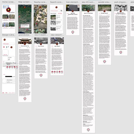
- Wireframes -
Wireframing sought to provide a general outline of the main screens as well as the main user flow. Screens for the home screen, map screen, search screen, and individual events were created with minimal stylings. The screens were hooked up to provide basic navigation between. From the main screen one button moves to the map screen. Another moves to the search screen. One to (what would be) the about screen. The final button moves to the 4.3 summary screen.
From the map screen and search screen you can navigate to the individual event screen. What would be the app icon/logo at the top of each screen allows the user to navigate back to the home screen.

- Mockups -
For this project, since it is a personal one, I opted to create a mockup of the app before doing the first usability study. This is because in past experiences I've found many testers get a little bit confused by the lack of UI elements and tend to focus in more on that issue (despite being instructed not to worry about it) rather than other aspects. So, I just decided to create a mockup first and then do a usability study on that. Since this app is a relatively simple one with only a handful of screens, I believe this is an acceptable choice. If the app was more complex then it would be better to do the study on the wireframes.

The initial mockups followed the format laid out in the wireframes. Images for sample events were added as were some basic information. For the sample events, almost full text was added to help simulate how it would look and feel to read the actual text.
A couple additions to the navigation were made between the wireframes and the mockups. The first was a simple 'back' button that is located near the top of the screen on the individual event pages. The decision to add this button was to give the user a quick 'exit' of the event if they discover it's not the event they wanted. While the logo button also gives the user a navigation option, the back button potentially saves them an extra tap or two.

The other addition was an expandable menu at the bottom of the individual event screens. This one took a little bit more thinking to decide whether to add it or not. This is because it adds an extra element to the screen and it's slightly debatable as to how much value it adds to the user experience. If a user reaches the end of the screen, then it's likely they reached the event they wanted to reach and they read through the content. So, the question is, "What does the user want to do next?" Where will they want to go?
My initial thought was that they would want to move to another event, but that goes against the primary usage case for this app which is to be used out and around Jeju when the user is near a 4.3 site. In that case they likely will not be looking to read several events at that moment. In all likelihood, the user will probably simply exit the app as they've read about the spot they are at. However, if they did want to move to another section of the app then where they want to go is slightly difficult to predict. So, I had two thoughts. The first was to add a 'to top' button that allowed moved the user back to the top where they could tap on the back button or the logo to go home. However, if they tap to go to the top and then tap again to go home or back, then why not just give them that option at the bottom? So, I added a menu that goes to any of the major screens.

- Lessons learned and conclusions -
This version of the mockup was sent to five people for a usability study. Those results plus the updates to the mockup will be shared in the next write up.
As for lessons learned, it's not a new lesson per se, but really pay attention to any initial user research you have and do find your niche in the existing market. Initially, I wasn't entirely sure what to do with a dedicated app version or whether it was really necessary to have one. However, based on the user research and the other major sources of information the app became a solid choice to expand on the overall user experience and should complement the website version.
Thank you for reading! If you have any questions or comments about this project or post, please feel free to use the e-mail button below to contact me. Thank you again, and have a nice day!