Bakery App Design

Summary: Google Career course using Figma to design an app from scratch
Date: 2022-08-05
Client: Google Career - UX Design Course
Tech Stack: Figma, Google Suite
Return Home
Local Bakery App Design - Case Study
🔗 Case study presentation (Google Slides)
🔗 Low fidelity prototype (Figma)
🔗 High fidelity prototype (Figma)
- Project background -
Role: For this project I served as the full UX designer. This included performing initial research, creating personas and user journeys, sketching wireframes, creating low fidelity wireframes and prototype in Figma, running a usability study and synthesizing results, and creating high fidelity mockups and prototype.
Project Goal: To create an app for a local bakery to increase customer satisfaction - specifically for to reduce confusion with delivery orders (delivery times) and to eliminate waiting for pick up orders.
Target Audience: The target audience for this app are individuals who regularly order bread from a bakery at least twice a week or more.
Duration: July 2022.

- Initial research and ideas -
Initial research focused on what type of customers regularly order bread or other baked goods from local bakeries (as opposed to general food markets) as well as what other competitors are doing currently.
- User personas -
From the initial research, two user personas were created. The first persona focused on younger individuals who rely on delivery services due to lack of personal transport or busy schedules. This user needs accurate delivery information in order to be able to know when their order will arrive and where the delivery person is (many live in dormitories or apartment complexes).

The second persona is representative of another common group discovered through the research - professionals who use bread/coffee as a quick meal or energy source for their busy day. These users, as compared to the first persona, do not rely on delivery as they have personal transportation due to their higher income level, but still want accurate information and the ability to pre-order items in order to minimize time spent standing on line and waiting for an order to be ready.

- User Journeys -
A typical journey through a bakery app was created to help create empathy with a potential user.

- Competitive analysis -
A competitive analysis was conducted on four competitors. These included two direct competitors (local bakeries) and two indirect competitors (one international brand and one local bakery that targeted a different audience). Through this analysis the following insights were created:
Local competitors do not offer delivery options (pick up only)
Local competitors do not have a dedicated app for ordering (utilize third-party services)
Local competitors seem to view online ordering and delivery as something they are not interested in pursuing (weak online branding and presence)
- Initial features and design ideas -
Based on the initial research and competitive analysis, a few ideas came to mind for initial features and design for the app.
The app must have a clear brand identity (utilize similar design patterns, fonts, colors).
Navigation should be simple and allow the user to move to almost any point in the app with only 1-2 taps/clicks.
Increase accessibility by utilizing more visual cues (common icons, images) rather than relying on large amounts of text.
Increase user comfort by minimizing amount of content on any one screen.
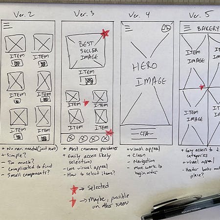
- Initial sketches -

Initial sketches for the app's home screen were done on paper to see a variety of potential styles and layouts.
- Low fidelity wireframe design -
Based on the paper sketches, an initial low fidelity wireframe was created using Figma. The wireframes focused on creating a consistent identity from screen to screen and creating a layout that was 'easy on the eyes' (meaning easily scannable with the eyes).

- Low fidelity prototype -
Following the completion of the wireframes, the screens were connected to create a working low fidelity prototype of the app. The prototype's main user flow follows the ability to order items (place items in cart -> option to continue shopping -> begin checkout -> select delivery or pick up -> select preferred information and payment -> confirm order).
The low fidelity prototype can be viewed and tested here.
- Usability study -
A usability study was conducted with five individuals in order to assess the prototypes success or failure to meet the initial goals for the project: easy navigation and comfortable ordering experience.
Overall, the study revealed that while the app was mostly easy to navigate and use, there were a few features in the app that were difficult to use. This included the bottom tab navigation (confusing icons), difficulty locating individual settings, and difficulty navigating to different categories.

- High fidelity mockup and prototyping -
The next step was to create the high fidelity version as well as implement the changes from the usability study results. The buttons in the tab navigation were changed to icons that were easier to understand and small text names were added underneath. The text names also helped with accessibility because now they could be understood more easily by screen readers and the like. Access to the different profile settings was also made easier by adding an extra link in the main navigation menu and more clear labeling.
In order to help ensure consistent styling across the screens, a sticker sheet was created to house fonts, colors, and commonly used components.

The flow of the screens within the high fidelity version followed the same as the low fidelity version. Colors were selected to be relatively minimal while still allowing for high levels of contrast and easy readability.

Following the completion of the high fidelity mockups, the screens were connected to create the high fidelity prototype. As mentioned earlier, the user flow followed the same ideas as in the low fidelity prototype version.
The high fidelity prototype can be viewed and tested here.

- Second usability study -
After completing the high fidelity prototype it was another round of usability testing and compiling results. The ideas tested in the second usability test were the same as the first usability test. In this round of testing, again five users completed the tasks. The results of the testing revealed that the major issues discovered in the first usability test had been resolved by the changes.
- Reflections on the project -
In all it was quite a challenge to run this design from start to finish. Several of the tasks I had experienced doing small web dev projects, but it was interesting and challenging to do it in a more organized and 'formal' process. Having said that I do believe that is it very important and a good thing to have that process. It helps ensure that steps aren't skipped which helps ensure that simple mistakes aren't made or certain aspects in regards to accessibility or things like that are not ignored. While it wasn't explicitly taught or recommended in this course, I have found that I am using organizational tools like Notion more in order to help pre-list the things needed to be done as I go through the second project. This helps keep things in line and moving.
The other major challenge that I experienced in this project was in creating user personas (fictional people who may use your product). While I generally consider myself to be empathetic with others, trying to think about how someone else who has (potentially) completely different backgrounds, experiences, thought processes from me was not easy. It's difficult to put aside your own biases and experiences when you imagine how someone may interact with something. I suppose this is something that comes with experience and from talking with people as they use different products and share their thoughts.
Overall, I enjoyed the process and the project. I feel like I learned a few very useful tips in terms of using Figma for design as well as processes and additional tools for design. If I had time to create a next step for this design, I would probably revisit the colors to help make it look a bit more 'modern' as well as look into more accessibility features to help non-native English speakers or those with other disabilities.
Thank You for Reading!
In the next entry, I'll discuss the design for the second Google Career Course certificate (UX design) portfolio project. If you have any questions or comments about this project, the Google Career Course for UX design, or anything else feel free to email me by clicking the button below!